

Matplotlib is a comprehensive library for creating static, animated, and interactive visualizations in Python. It is perfect for visualizing and presenting our data findings in a way that non-tech people can unstand it as well.
When working with matplotlib in our notebooks we need a magic command at top allow matplotlib to render its plots inline.
%matplotlib inline
import matplotlib.pyplot as plt
Creating a plot is as simple as running the .plot method but this will render an empty plot. We can however use pandas or numpy to create some data for our x and y axis and then plot that:
x = [2,4,6,8]
y = [10,20,30,40]

plt.plot(x,y);
However most of the time we don’t directly plot data simply because the resulting plot is not very descriptive. Instead, we create a plot object and use an OO approach to make our plots shine.
x = [2,6,10,15]
y = [33,76,80,110]

fig, ax = plt.subplots(figsize=(10,10))

ax.set(
    title="Our plot",
    xlabel="My fancy X axis",
    ylabel="Your fancy Y axis"
)

ax.plot(x,y);
Since we are so proud of our plot we can lean back and save it as well
fig.savefig("_images/our_fancy_plot.png")
Using pandas and matplotlib
The power of matplotlib lies in displayind data. However, importing and sanatizing data isn’t matplotlib’s strength but pandas’s strength.
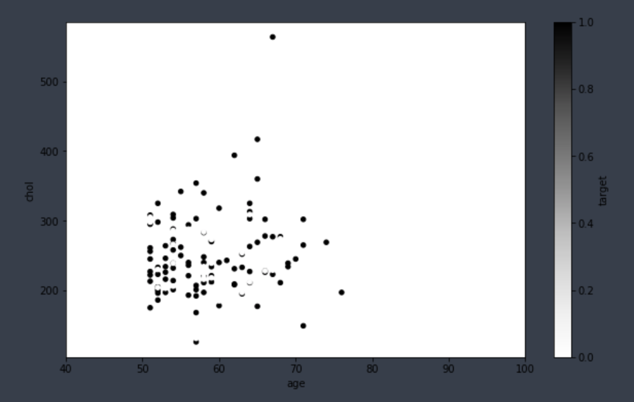
# import some heart disease data from kaggle
heart_disease = pd.read_csv("_data/heart-disease.csv")

# query for all patients over 50 years
over_50 = heart_disease[heart_disease["age"] > 50]

# create our plot object
fig, ax =  plt.subplots(figsize=(10,6))

# give it fancy descriptions
over_50.plot.scatter(
    x="age",
    y="chol",
    c="target",
    ax=ax
)

# limit the x axis
ax.set_xlim([40,100]);
And that was it folks.